Flex-box Slide Revealer With JavaScript, HTML, and CSS
☕️ Summary
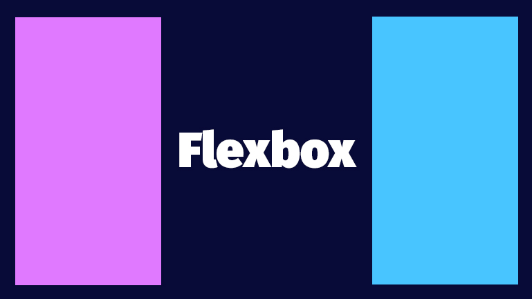
Flexbox is a really nice CSS module that provides a ton of...flexibility. 😁
In this small guide, we're going to build a simple design with HTML, CSS, and JavaScript. We're going to call this design - Slide Revealer. If you want to skip to the full code, see the CodePen at the bottom of the page. 👇
📝 Table Of Contents
🔬 How It Works
We use HTML to create the layout of elements, CSS to style those elements, and JavaScript to manipulate our HTML and CSS.
⚙️ HTML Code
First, we need to create a button that we can use to trigger events when the user clicks. Let's go ahead and add that to our HTML file.
Pretty simple, add a <div> element with a class="open-button" class that will wrap around a <button> element.
We also want to add a function to handle button click events so we add our own onclick="onClick()" property. Later, in our JavaScript we will define the logic for the onClick() function that will execute on every click.
<div class="open-button">
  <button onclick="onClick()">👈 Trigger 👉</button>
</div>
Secondly, we need to define 3 <div> elements that will make up our Slide Revealer and 1 more <div> element that will serve as the wrapper or more specifically the flex-box container that will hold our flexible elements.
<div class="block-wrapper">
  <div class="left-block"></div>
  <div class="middle-block close"></div>
  <div class="right-block"></div>
</div>
We add classes to all of our elements so that we can define the styles for them in our CSS file. Note: the close class in our middle <div> will be useful for us to toggle this between and open and close.
But that's all of the HTML we need, now onto the CSS styling! 🎨
⚙️ CSS Code
First, we need to style the container that holds our <button> so that it's centered, and also above the other elements on our page. It's cliche that centering anything in CSS is super tricky but once you do it a couple of times it's pretty easy.
Since we added class="open-button" to the wrapper around our button, we can define a style for that class which will position our button.
Notice the z-index: 2; is how we can place the button on a higher "layer" than the other elements on the page. For example, if we added another element and gave it z-index: 3; it would be 1 layer higher than our button, and 2 layers higher than the other elements on the page.
Note: the z-index property only works on elements that are also positioned. For this case our button wrapper element has position: absolute; so it works. 👌
.open-button {
  position: absolute;
  top: 250px;
  width: 100%;
  text-align: center;
  font-size: 18px;
  z-index: 2;
}
💪 Flex-box
Now let's dive into the actual flex-box functionality.
Flex-box will automatically make the elements inside of a container - flexible. There is sooo much that you can do with flex-box but for this example, we will stick to the specific functionality of our Slide Revealer.
.block-wrapper: this is the class for our flex-box container. By setting the display property to flex, we allow the elements inside of the container to be flexible. We also set dimensional properties so that the elements inside can automatically be responsive.
.left-block & .right-block: these are the classes for our two outer slides. We give them the flex: 1; property. This actually determines the flex-grow factor relative to the size on the container and the other flexible elements inside the container. This can be confusing at first but you'll see how this works in the CodePen demo at the bottom of this page! ⏬
.close: this is the class that we will attach and detach to our middle block element to close our slider. We give it a flex property with a flex-grow factor of 0. This actually makes sense...we want to attach this class to the middle-block element to give it a size of 0. We want it to take up no space when it's closed.
.open: similar to our class to close the slider, we will be attaching and detaching this class to our middle-block element to open the slider. We give it a flex property with a flex-grow factor of 10. To explain how this will work...our .left-block and .right-block will always have a flex-grow factor of 1, and if our .open class with a flex-grow factor of 10 is attached to our middle-block element, the size of each block in the container are relative to 1+10+1=12. So when we open our slider, the middle block will then occupy 10/12ths of the total size of the container.
Okay, that's a lot but hopefully that makes sense. 😅
.block-wrapper {
  display: flex;
  width: auto;
  height: 500px;
}

.left-block {
  flex: 1;
  background-color: #0b9ed9;
}

.close {
  flex: 0;
}

.open {
  flex: 10;
}

.right-block {
  flex: 1;
  background-color: #024873;
}
One more thing for our CSS. We want to elegantly open and close our sliders. With just the CSS that we have so far, swapping back and forth between .open and .close would just immediately snap the sliders open and closed. That's pretty ugly (although maybe that's what you need for your use case) and is a little bit jarring for the user.
This is where we can utilize a CSS transition!
So let's add a transition effect to all of our <div> elements.
div {
  transition: all 0.5s;
}
Yep, that's all we need. So now, we will get a smooth transition animation that has a time duration of 0.5 seconds!
Originally when this Slide Revealer was made, we actually were using
transition: flex 0.5s, but the transition with the flex property did not work properly on Safari. Now,allworks across all browsers that we've tested so far.
That's all for our CSS file! But our button doesn't actually do anything for us yet.
⚙️ JavaScript Code
So now we need to actually do something to our elements whenever a user clicks on a button. All we need to do is create and onClick function!
const onClick = () => {
  const middleBlock = window.document.getElementsByClassName("middle-block")[0];
  const blockState = middleBlock.classList[1];

  if (blockState === "open") {
    middleBlock.classList.remove("open");
    middleBlock.classList.add("close");
  } else {
    middleBlock.classList.remove("close");
    middleBlock.classList.add("open");
  }
};
If you've seen Manipulating CSS Classes To Trigger Animations then you'll be familiar with this function.
middleBlock stores a reference to our middle-block element.
blockState stores a reference to the 2nd index in the array that is returned from the .classList function which just grabs all of the classes currently attached to our middle-block element.
Then, we just add an if-else statement that checks to see if the currently attached class is .open or .close and will perform a swap.
Annnnnddddd, that's it! Try playing around with the code in the CodePen below. That's the best way to learn. Just hop in and change some of the values.
Happy Coding. 👋